Kinetic Typography
Ideation
Potential Audio Choices:
My Brother, My Brother, and Me — Teen Names (39 Seconds)
This clip from MBMBAM is personally one of my favorites and features the dynamic between the three McElroy brothers (Justin, Travis, and Griffin) as they discuss how to generate a perfect teen name to relate to the younger generation. I think the overlapping comments and the tone of the conversation would be fun and entertaining visually to portray. I think type wise I would have a sans serif as their conversation moves along, but once they generate their teen name I think to add to the humor having it as something along the lines of comic sans.
—
Marvelous Misadventures of Flapjack — Fishing with K’nuckles (44 Seconds)*
This is also one of my favorite scenes from this show. The scene has Captain K’nuckles attempting to fish while his apprentice, Flapjack, asks him questions. The dynamic and vocal difference between the two would have opportunities for two contrasting font types, such as K’nuckles deep rugged voice vs Flapjack’s peppy young voice. With this clip as well, it has a great balance of regular voice deliveries vs quick lines added when appropriate. There are a few slight pauses within the middle that could be a little awkward to work with, but otherwise I think it would be a strong competitor.
*I decided that I am going with this option.
—
Game Grumps — What’s Updog? (41 Seconds)
In this Game Grumps clip, Arin Hanson tries to trick Dan Avidan into saying “What is Updog?”. I love this clip simply because the listener can tell the moment that Arin heard Danny say “I just remembered what’s up here” immediately springs into trying to get Danny to say the phrase relentlessly as Dan is focused on completing the game until the end. I also love the various “uh”s and “um”s throughout the audio as well.


Audio Transcript:
Hey Captain!
What now boy?
How come fishies live in the ocean?
Uhhhhhhhh… Fish don’t have clothes so they feel stupid walkin’ around on land.
You know what I like Captain?
No?
Fishin’. You know what I like more than fishin’?
I don’t care!
Fishin’ with you. And you know what I like even more than fishing with you?
*Groan*
…You
Get off me! You’re giving me the bad luck. Go away or we’ll never catch a fish and you know what that means.
I’m sorry Captain!
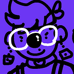
Styleframes


Within the show, there are watercolor backgrounds which made me want to at least test out and see what a slight watercolor paper texture on the back with the color palette would look. I’m not against it, but I think I need to look into another type or lighten some of the darker spots to make it not as distracting on a light background such as my yellows and off-white.


These two style frames lead into another with flapjack asking about fishes living in the ocean. I thought since this is at the beginning of the audio it would be a good opportunity to introduce my two teals into the palette as Captain K’nuckles takes on the speaking role as well. I also tested the watercolor texture on the darker teal and I like it better used there.
Storyboard

Motion Test
15 Seconds
30 Seconds
Final
Rationale
For my kinetic typography project I decided to go with an audio selection from a children’s cartoon called the Marvelous Misadventures of Flapjack. Within the audio, it is a playful conversation between young Flapjack and his inspiration, a rugged pirate, named Captain K’nuckles. During this conversation about fishing, Flapjack unintentionally becomes more annoying to K’nuckles making the conversation more of a playful banter between the two. My font choice for Flapjack is Circe Slab Extra Light, this is due to his high-pitched silly voice that I thought would be appropriate for his age and sinuous speaking habits. As for Captain K’nuckles, I chose Trilby Black due to his rugged assertive tone he naturally uses and to contrast Flapjack’s thin delicate type with a heavy weight type. Both fonts I wanted a distinct contrast between the two while also both being slab serif fonts paying homage to the slab serif fonts found on the signage within the cartoon. As for the color palette, all colors were based from frames of the cartoon as well as the main characters as well. I wanted texture to play a part of this as well with the slight watercolor texture featured in the background. Within the cartoon, all of the backgrounds are watercolor paintings and I felt it was appropriate to feature that here as well.