Restaurant Branding — Scooped Up
Initial Research:
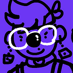
My concept for my restaurant started with the idea of a family friendly ice cream shop that’s based around circus/clown aesthetic. I wanted a more modern version of ice cream shops offering a made to order ice cream and wanted it to be leaning more towards children, but not too childish that parents and individuals of all ages can enjoy as well.
I personally love design for a younger demographic, so I started with research of other designs focused towards kids and their choices. A rounded sans serif type was the first thing thought of as well as some colors that are reminiscent of primaries, but not overdone.
As for titling the ice cream shop I was thinking about combining phrases and items from both ice cream and circus themes. Scooped Up came from scooping ice cream and thinking about gathering kids together “scooping them up”. As well as the catchphrase, “Cone one, Cone all”, playing off of the phrase “Come one, come all” used commonly by a ringleader or carnival barker replaced by cone.
Concept:
Family-friendly circus themed ice cream shop with a rounded simple aesthetic. Demographic leaning towards kids, but not too childish for other ages.

Process:


Color trials of two palettes I thought were appropriate. Both are a play on primaries commonly used for a demographic for children. The first one is more circus themed with more muted versions compared to the bright primaries and the second one is a more playful carnival sweets take on the color palette such as cotton candy and the trailers they sell them from.


I wanted to play with deconstructing my alternative mark to create more varied patterns.


For my collateral, I wanted to create biodegradable / recyclable ice cream cone wrappers and cups. These would feature both the main wordmark, alternative logo, and the pattern made from another alternative logo as well.